Anna’s Food Guide — A Food Education App for Teenagers
A personal project — a bilingual food education app built for my teenage daughter, designed to feel like the apps she actually uses, not a health tool.
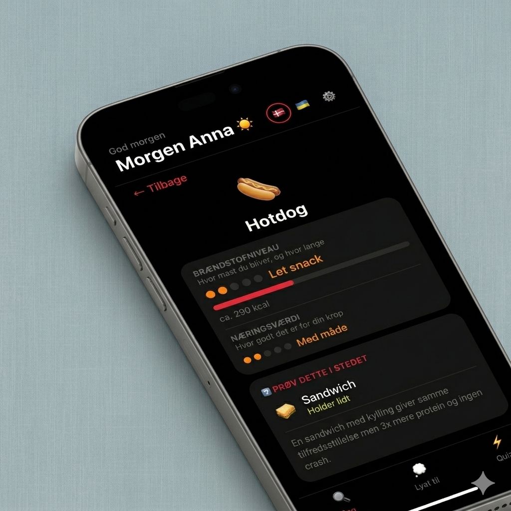
Anna’s Food Guide is a bilingual food education app I built for my teenage daughter. It’s live at anna.paladii.com. The point of including it here isn’t the scale — it’s the example of how I work end-to-end on something with a real audience of one, where the framing and tone of the content matter as much as the design.
This one started at the dinner table. My teenage daughter was going through a phase of worrying about what she was eating — not in an informed way, but in a vague, anxious way that a lot of teenagers have. She knew some foods were “bad” but didn’t really understand why, and she didn’t have a mental model for making better choices.
I couldn’t find anything that felt right for her age. Most nutrition apps are either for adults tracking macros, or for small children with cartoon characters. Nothing in between. Nothing that would actually hold a teenager’s attention.
So I built one — with some help from Claude Code.
The challenge
The core design problem was motivation. A teenager isn’t going to use a health app that feels like homework. It needed to feel like something she’d actually choose to open — closer to a game or a social app than a nutrition guide.
There was also a real content sensitivity challenge. My daughter is at an age where messaging around food and body image matters a lot. The framing couldn’t be about restriction or calories as something to fear. Everything had to be framed positively — what food gives you, how long it keeps you full, what your body actually gets from it. The search screen even carries a direct message: “When you eat too little, the body goes into conservation mode and holds onto fat. Smart food > no food.”
And practically: she switches between Danish and Ukrainian at home, so the app needed to work in both.
The solution
The app has three sections, accessible from a bottom tab navigation that feels immediately familiar to anyone used to TikTok or Instagram.
Search lets you look up any food and see its fuel level — how full it keeps you and for how long — and nutritional value, both shown as dot-based ratings with plain-language labels like “Mætter godt” (fills you well) or “Hurtig sult” (quick hunger). Each food detail page shows approximate calories and a short, direct verdict. No hedging, no nutritionist tone.
Lyst til (Craving) is the most interesting section. Instead of browsing a food list, you start by tapping what you’re in the mood for — sweet, salty, crunchy, filling, fast, cold, warm. The app then shows relevant options that match the craving, with better choices listed first. Each item includes simple prep instructions.
Quiz is a quick food comparison game — the original concept that started the project. Six questions, pick the healthier of two options, instant feedback with a one-line explanation. No penalty for wrong answers, just learning.
The visual design is deliberately dark and bold — true black background, hot pink as the primary action color, heavy typography. It references the apps she actually uses, not what a health app “should” look like.
The outcome
The app is live at anna.paladii.com. It’s a working product with real content, three distinct modes of interaction, and full Danish/Ukrainian support.
Building it with Claude Code changed the pace significantly — I could iterate on functionality much faster than I could alone, spending more time on content decisions and framing than on the code itself.
The feedback loop was immediate and honest. She used it. That was enough.
The settings sheet shows the name field with her name in it, and at the bottom: “Lavet med ❤️ af Far og Claude 💜” — made with love by Dad and Claude.